

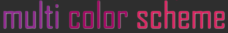
The Power of Color in Web Design & Brand Marketing
Color is the most powerful method of design and brand recognition in marketing.
Color is like another language, and if misrepresented, it can lead to a negative association or feeling about your brand. Have you ever considered the effect certain colors have on your customers’ influence or perception? We suggest investing the time to learn about the colors aligned with the culture of your target audience. The visual symbolism of color communicates a message without using words, and with a clear understanding of color perceptions across cultures, choosing the right colors will greatly impact how your brand is represented.
Color affects consumer behavior in many ways. The impact of color on marketing can profoundly shape brand-customer relationships. When brands reach customers emotionally, that deeper connection builds the foundation of brand awareness, trust, and even buying habits. Many factors influence how and what consumers buy — but the strongest and most persuasive is color. In fact, 85% of customers list color as a primary reason for purchasing a particular product. However, avoid relying solely on your personal color associations, because your audience may interpret them differently.
ALSO READ: Building Brand Loyalty and Trust with Relationship Marketing
What is your favorite color’s message and how does it attract shoppers?
Red:
• Evokes energy, passion, and love
• Increases heart rate and stimulates urgency; iconic for power and danger
• Impulse shoppers: Fast food, outlet malls, clearance sales
Red often stimulates appetite, which is why fast food chains pair it with yellow — urgency plus optimism tells a strong story.
Orange:
• Aggressive; signals caution
• Creates cheerfulness, enthusiasm, optimism
• Impulse shoppers: Fast food, outlets, clearance
• Strong call-to-action color: subscribe, buy, redeem
Yellow:
• Optimistic and youthful
• Creates happiness and calm
• Atmosphere of positivity
• Impulse shoppers: Fast food, outlet malls
• Often used to capture attention from window shoppers
Green:
• Easiest color for the eyes to process
• Evokes balance and relaxation
• Associated with prosperity and wealth
• Strongly associated with nature, growth, and renewal
Blue:
• Most popular color worldwide, personally and in business logos
• Represents trust, security, authority
• Conveys intellect and responsibility
• Relaxing and peaceful
• Impulse shoppers: Budget-conscious, traditional buyers
• Common in banks, department stores, clothing brands
Purple:
• Soothing and calming
• Symbolizes royalty, wisdom, respect
• Stimulates creativity and imagination
• Common in beauty and anti-aging products
Pink:
• Romantic, feminine, sweet
• Used in marketing toward women and young girls
• Also calming
Black:
• Powerful and sleek
• Conveys authority, stability, strength
• Common for luxury products
Now that you understand how colors influence behavior, it’s equally important to apply Color Theory concepts such as Contrast, Vibrancy, and Color Schemes to strengthen your marketing impact.
• Vibrant colors evoke energy and excitement
• Dark or neutral color schemes help relax customers when processing a lot of information
• Popular color scheme types: Monochromatic, Complementary, and Triadic
ALSO READ: A Picture is Worth a Thousand Words

Uses one color in multiple shades for a minimalist, calming effect.

Uses colors from opposite sides of the color wheel — visually engaging and balanced.
Uses three evenly spaced colors — bold, vibrant, and cohesive.
In conclusion, there is no exact science to color in marketing. Understanding your audience’s cultural and emotional associations with color will guide you toward making more meaningful design decisions. Let Brandit help you choose the perfect colors to strengthen your brand and build trust with customers. We proudly serve clients across Manchester, Nashua, and Concord, NH.
Want to Learn More About Marketing Automation? CLICK HERE!
Know exactly what you need but not sure how to start the process? Click the link to schedule a time to chat with us.
- Color is the most powerful method of design and brand recognition in marketing.
- ALSO READ: Building Brand Loyalty and Trust with Relationship Marketing
- What is your favorite color's message and how does it attract shoppers?
- ALSO READ: A Picture is Worth a Thousand Words
- Want to Learn More About Marketing Automation? CLICK HERE!
Ready to Take Your Brand Beyond Ordinary?
Your marketing shouldn’t just exist. It should perform. If you’re done settling for “good enough,” let’s build something impossible to ignore. Brandit helps you connect every digital, physical, and promotional touchpoint into one unstoppable brand experience.
Real Results,
Real Reactions
What Our Clients Say
"I sent out three bids for my marketing needs for this year and Brandit was the most responsive and provided great ideas. One company I reached out hadn't even gotten back to me while the other wasn't even close to being comparable to Brandit's creativity, pricing and service."
"I have used Brandit for several projects and they always come through with fantastic pricing and customer service. I highly recommend them."
Southern New Hampshire University

"Thanks to Brandit's generous contribution to the Big Ideas for Building Independence Capital Campaign, Easterseals NH is now better able to serve people with disabilities or special needs. With your support, we raised nearly $2.6 million for renovations to our headquarters."
"It has been an incredible journey! We couldn't have done it without you, and wish to take this opportunity to thank you and your team at Brandit Marketing Solutions for all that you have done and your generous donation."
Easterseals, NH
"Bringing Brandit Marketing Solutions into the CMC-fold is the best thing and most appreciative thing I've done since being at the Hospital."
Catholic Medical Center
"Exceptional does not even begin to cover the work that these people do. I have worked closely with other marketing firms and Brandit tops them every time. From innovative ideas to customer service that rivals the best of the best. I just couldn't speak more highly of them."
Southern New Hampshire University
"The Granite Group, headquartered in Concord, NH, distributes plumbing, heating, cooling, water and propane supplies to contractors and fuel dealers across New England through over 45 wholesale branches and their Online Store. The company also operates 15 retail showrooms under The Ultimate Bath Store name.
Brandit is pleased to say that we have been working with the Granite Group for over ten years which happens to be almost as long as this company has been in existence. In 2020, TGG was named one of New Hampshire's best places to work."
The Granite Group
10+ Year Partnership

"Over my long career, I have been in a position where I have worked closely with numerous vendors/suppliers. I can honestly say that I have never engaged with a company that is as amazing and responsive as Brandit."
"A sincere thanks to the team for the hustle on getting our shirts and tradeshow materials done for our group! You really relieved our pressure and I know it wasn't an easy task. Your effort and turnaround time was and is appreciated. Believe me when I say that I do not take for granted the relationship we have built over the years. Your service is top notch."
C&S Wholesale Grocers
"For almost a decade, the team at Brandit delivered successful and effective marketing solutions, spearheaded the merchandising of the FIRST brand by creating one-of-a-kind products, built, hosted, and managed their very first ecommerce store supporting all programs, staff, partners, sponsors, teams, and customers globally.
In addition, Brandit set up and managed multiple on-site retail stores at their premier Championship events where we serviced over 65,000 attendees. Today we provide web services as well as branded merchandise for regional partners".
FIRST Robotics
"The Brandit Marketing Solutions Ltd Team is wonderful to work with and we appreciate what they do to make us look good! They have expanded their services in recent years to meet whatever marketing needs you may have…from apparel and giveaway items to video and web services to graphic design and printing services, even graphic enhancements for your interior/exterior office space."
"I have worked with this team since the founding of their company and look forward to many more years of working together!"
Boys & Girls Club of Manchester

"The Brandit team is a talented group of creative professionals that I've worked with for years. Top notch!"
Art Murphy
Our Insights
.

Stale Service Pages Tell Google You’ve Closed. Here’s How to Tell It You Haven’t
Your phone used to ring. Then it slowed. Now your top service page sits on page two of Google, and you have no idea why. Nothing is broken. Your site loads. Your contact form works. Your services are the same ones you offered last year, and the year before that. So what changed? Probably nothing…

Your New Hire’s First Day Says a Lot About Your Company. The Welcome Kit Decides What.
Your new hire shows up on day one. Their laptop isn’t ready. Their manager is in back-to-back meetings. Someone hands them a stack of forms and a pen with another company’s logo on it. You just told them everything they need to know. The first day isn’t just paperwork. It’s the moment a new employee…

Your 4.7-Star Rating Is Quietly Losing You Customers
You opened your Google Business Profile this morning and saw a 4.7-star average across 34 reviews. Solid, right? Here’s the uncomfortable part. The most recent review is eight months old. None of them have owner responses. And down the street, a competitor sitting at 4.5 stars with 180 reviews, fresh feedback, and visible replies is…

Regional Trade Show Marketing: Why Smaller Shows Can Deliver Bigger ROI
You just spent $25,000 on a booth at a massive industry expo. Three days, 40,000 attendees, and a fishbowl full of business cards. Back at the office, your team starts making calls. Most numbers go to voicemail. The ones who do pick up barely remember your booth. Sound familiar? Here’s a number that should change…

Website Security for Businesses: Your 2026 Survival Guide
Picture this. At 2:47 on a Tuesday morning, a retailer in Portsmouth has 3,400 login attempts hit the admin page of her WordPress site in under six minutes. By 2:53, one of them works. By sunrise, her homepage is redirecting customers to a fake pharmaceutical site, her Google rankings have collapsed, and her payment processor…

Google Local Services Ads: The Most Valuable Digital Real Estate for Local Businesses.
It’s 11 PM on a Thursday in January. The temperature outside is nine degrees. And your furnace just stopped working. You grab your phone. You type “emergency furnace repair near me.” And you do what every single person in that situation does: you tap the first thing that looks trustworthy. You don’t scroll. You don’t…

How to Build a Brand That Feels Human in an AI-Heavy Marketing World
There’s a beverage company you’d recognize by name. Last holiday season, their marketing team decided to rebuild their iconic TV ad using generative AI. New technology. Massive efficiency gains. Fraction of the production cost. The internet tore it apart. Viewers called it soulless. They weren’t wrong. The ad looked technically perfect in every sense, and…

Is Zero-Click Search Killing Your Website Traffic? Here’s the Real Answer
She refreshed the analytics dashboard one more time, hoping the numbers had changed. They hadn’t. Website sessions were down 31% year over year. The phone wasn’t ringing less. Leads were actually up. But her web traffic looked like it was falling off a cliff, and she couldn’t explain it to her business partner without sounding…

How to Turn Customer Wins Into B2B Success Stories That Actually Drive Sales
In B2B marketing, trust matters more than ever. Most buyers are not looking for another polished pitch. Instead, they want proof. They want to know your solution works, that companies like theirs have seen results, and that choosing you feels like a smart move. That is why customer success stories are so valuable. A strong…

Schema Markup: The Invisible Code That Gets Your Business Found on Google
You searched for a plumber at 9 PM on a Tuesday. Not just any plumber. One near you, with good reviews, open right now. Google handed you three options at the top of the page. Stars. Hours. Phone number. One click to call. You picked the first one. Here’s what you probably didn’t think about:…
Omnichannel Marketing Solutions
Merging creativity and technology for comprehensive brand experiences.
PIXELS
Harnessing digital platforms for impactful brand promotion and audience engagement through strategic touchpoints.
PROMOS
Making the intangible tangible through high-quality promotional items that echo your brand's voice and values.
PLACES
Transforming physical environments into powerful brand narratives that forge connections with everyone who enters your space.