
Brand Consistency: Make Your Site & Sign Match
Your website looks sharp. Your storefront sign looks fine. Your business cards came back a slightly different shade of blue than you remembered. Each one on its own seems like a small thing. Together, they cost you customers and money.
Brand consistency is whether everything a customer sees from you looks and sounds like it came from the same company. Your site, your signage, your printed materials, your branded merch. When those things line up, people trust you faster. When they clash, people hesitate. And hesitation is expensive.
Here is what is actually happening in your customer’s head, what the drift costs you, and a few approachable steps to fix it.
Your customer’s brain is lazy, and that helps you
The human brain is wired to spend as little energy as possible. When someone looks at your business, they are not running a careful analysis. They are asking a much simpler question without realizing it: does this feel easy or does this feel off?
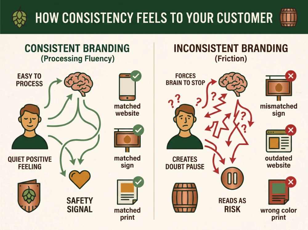
Researchers call that ease “processing fluency.” When your colors, fonts, and message match across every touchpoint, a customer processes you without friction. That smoothness registers as a quiet positive feeling, and the brain reads it as a safety signal. There is an old survival instinct underneath it all: if something is familiar, it has not hurt you yet.
Now flip it. A polished website paired with a faded, mismatched sign forces the brain to stop and resolve the contradiction. That pause is doubt. The customer cannot tell you why, but they trust you a little less. Brand consistency removes that pause.
What inconsistency actually costs
This is not a soft, feel-good idea. The friction shows up in real numbers.
Industry research on brand consistency keeps landing on the same pattern. Consistent presentation across channels is linked to revenue gains in the 10 to 20% range, and as high as roughly a third for the most disciplined operators. More than 8 in 10 buyers say they would pay more for a better, more consistent experience. People will reward you for being easy to trust.
The cost of getting it wrong is just as real. Studies suggest consumers need around 30% more value to choose a scattered brand over a consistent competitor, because a fragmented identity reads as risk. And about a third of customers will walk away after a single confusing experience. You do not always get a second chance to look like yourself.
The quiet budget drain: teams without a single, organized library of approved logos and templates burn time and money recreating assets that already exist. Nearly half of marketers report rebuilding files they already had, simply because nobody could find the right version.
The color trap nobody warns you about
Here is the failure point that catches almost every business off guard. Your logo looks electric and vibrant on a phone screen, then prints muddy and dull on a brochure or a storefront sign. You did not do anything wrong. This is just physics.
Screens make color with light. They mix red, green, and blue to glow directly into your eye, which is why digital blues and greens can look so bright. Print makes color with ink that absorbs light instead of emitting it. That ink-based system simply cannot reach some of the vivid tones a screen can, so when a screen color gets converted for print, it shifts toward something flatter.
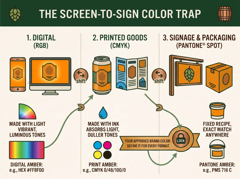
The fix is to stop treating your brand color as one value. Define it for every format you use:
- A digital value for your website, email, and social (the RGB or HEX code)
- A print value for brochures and flyers (the CMYK mix)
- A standardized ink value for signage and packaging (a Pantone spot color)
A Pantone color is pre-mixed to a fixed recipe, so a sign shop in Manchester and a printer in Portland produce the same blue instead of two close-but-not-quite versions. Lock those three values down once, hand them to every vendor, and the screen-to-sign drift mostly disappears.
How to put brand consistency into practice
You do not need a design degree or a six-figure rebrand to fix this. What you need is a short, honest audit and a few decisions. Brand consistency is mostly about good habits, not big budgets. Start here.
1. Line everything up
Put it all side by side. Pull up your website on a screen, set your business card next to it, add a printed flyer, a branded pen or shirt, and a photo of your sign. Look at them together the way a customer never gets to. Most owners spot three or four mismatches in the first minute: a logo with too much space around it here, an off shade of your color there, a font that crept in from a template.
2. Settle your colors and fonts
Write down your exact color values in all three formats and the one or two fonts you actually use. This is the single highest-payoff step for brand consistency, because color and type are what the eye clocks first.
3. Build one source of truth
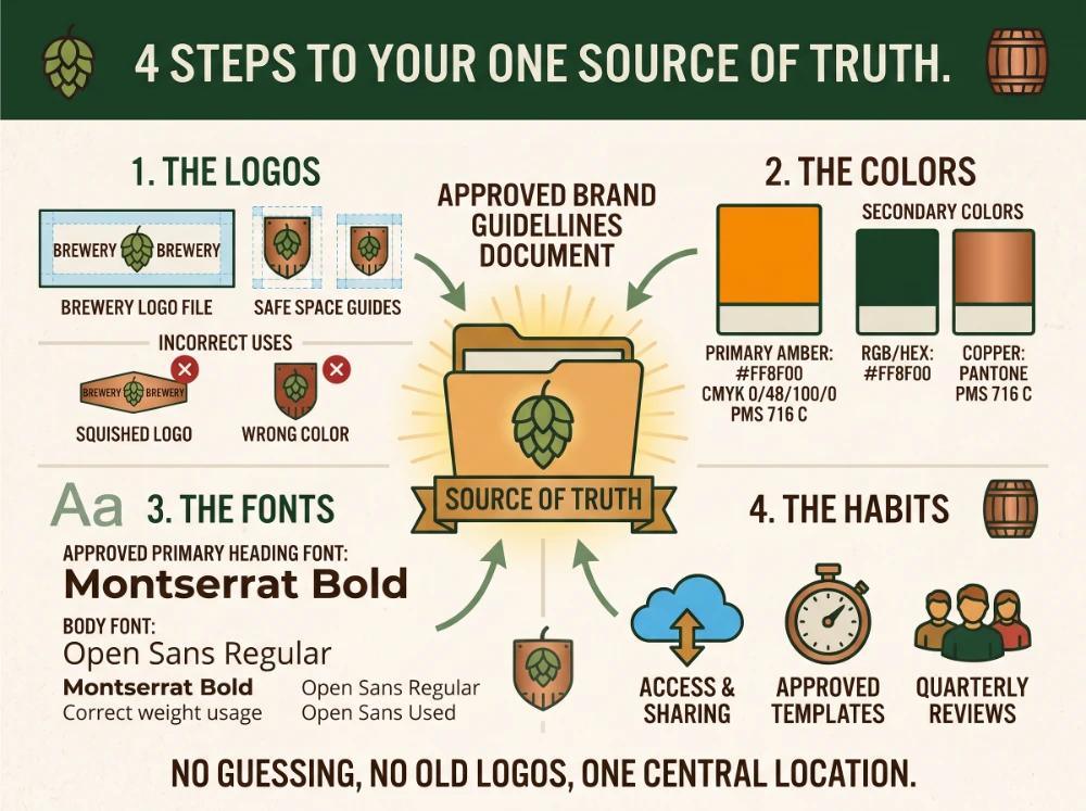
Create a simple, shared document with your approved logo files, your color values, your fonts, and a few examples of correct use. It does not need to be fancy. It needs to be the place every employee and every vendor goes, so nobody is guessing or grabbing an old logo off an email from two years ago.
4. Decide what is fixed and what can flex
Some things should never change: your logo proportions, your core colors, your fonts. Other things have to adapt to reality, like the size of a sign that has to fit a specific storefront or clear a local sign ordinance. Naming what is locked and what is flexible ahead of time keeps your identity intact while still letting field teams solve real-world problems.
Even Apple has tripped on this. At the Apple Park visitor center, the signage was kept so minimal that guests could not find the restrooms, and the company had to post a staff member to point the way. The lesson: consistency should never come at the cost of basic usability. Clean is good. Confusing is not.
Where the gaps usually hide
Drift rarely happens because someone made a bad decision. It happens at the handoffs. Your web person builds the site. A sign company fabricates the storefront. A promo vendor prints the shirts and the trade show banner. Each one does solid work in their own lane, and your brand slowly splits into three slightly different versions because no one was watching the whole picture.
That is the real argument for keeping your digital, signage, and printed work connected under one set of standards. When the same color values, the same logo files, and the same rules follow your brand from the screen to the street to the giveaway table, you stop paying the inconsistency tax. Brand consistency is not about being rigid. It is about being recognizable everywhere a customer runs into you.
Want to know where your brand is drifting? We help businesses across New Hampshire, Southern Maine, and the Greater Boston area line up their websites, signage, and branded materials so everything looks like it came from the same place. If you would like a straight look at where your touchpoints match and where they do not, reach out. No pitch, just an honest read on your brand.
Ready to Take Your Brand Beyond Ordinary?
Your marketing shouldn’t just exist. It should perform. If you’re done settling for “good enough,” let’s build something impossible to ignore. Brandit helps you connect every digital, physical, and promotional touchpoint into one unstoppable brand experience.
Real Results,
Real Reactions
What Our Clients Say

"I sent out three bids for my marketing needs for this year and Brandit was the most responsive and provided great ideas. One company I reached out hadn't even gotten back to me while the other wasn't even close to being comparable to Brandit's creativity, pricing and service."
"I have used Brandit for several projects and they always come through with fantastic pricing and customer service. I highly recommend them."
Southern New Hampshire University

"Thanks to Brandit's generous contribution to the Big Ideas for Building Independence Capital Campaign, Easterseals NH is now better able to serve people with disabilities or special needs. With your support, we raised nearly $2.6 million for renovations to our headquarters."
"It has been an incredible journey! We couldn't have done it without you, and wish to take this opportunity to thank you and your team at Brandit Marketing Solutions for all that you have done and your generous donation."
Easterseals, NH

"Bringing Brandit Marketing Solutions into the CMC-fold is the best thing and most appreciative thing I've done since being at the Hospital."
Catholic Medical Center
"Exceptional does not even begin to cover the work that these people do. I have worked closely with other marketing firms and Brandit tops them every time. From innovative ideas to customer service that rivals the best of the best. I just couldn't speak more highly of them."
Southern New Hampshire University

"The Granite Group, headquartered in Concord, NH, distributes plumbing, heating, cooling, water and propane supplies to contractors and fuel dealers across New England through over 45 wholesale branches and their Online Store. The company also operates 15 retail showrooms under The Ultimate Bath Store name.
Brandit is pleased to say that we have been working with the Granite Group for over ten years which happens to be almost as long as this company has been in existence. In 2020, TGG was named one of New Hampshire's best places to work."
The Granite Group
10+ Year Partnership

"Over my long career, I have been in a position where I have worked closely with numerous vendors/suppliers. I can honestly say that I have never engaged with a company that is as amazing and responsive as Brandit."
"A sincere thanks to the team for the hustle on getting our shirts and tradeshow materials done for our group! You really relieved our pressure and I know it wasn't an easy task. Your effort and turnaround time was and is appreciated. Believe me when I say that I do not take for granted the relationship we have built over the years. Your service is top notch."
C&S Wholesale Grocers

"For almost a decade, the team at Brandit delivered successful and effective marketing solutions, spearheaded the merchandising of the FIRST brand by creating one-of-a-kind products, built, hosted, and managed their very first ecommerce store supporting all programs, staff, partners, sponsors, teams, and customers globally.
In addition, Brandit set up and managed multiple on-site retail stores at their premier Championship events where we serviced over 65,000 attendees. Today we provide web services as well as branded merchandise for regional partners".
FIRST Robotics

"The Brandit Marketing Solutions Ltd Team is wonderful to work with and we appreciate what they do to make us look good! They have expanded their services in recent years to meet whatever marketing needs you may have…from apparel and giveaway items to video and web services to graphic design and printing services, even graphic enhancements for your interior/exterior office space."
"I have worked with this team since the founding of their company and look forward to many more years of working together!"
Boys & Girls Club of Manchester

"The Brandit team is a talented group of creative professionals that I've worked with for years. Top notch!"
Art Murphy
Our Insights
.

Sustainable Promotional Products: A Buyer’s Reality Check
That recycled tote you ordered for the trade show has a problem. The product page called it eco-friendly, you felt good about the choice, and you moved on. Here is the uncomfortable part: when auditors actually test merchandise carrying self-declared green labels, close to half cannot back up the claim. The word on the page…
What Is AI Search Readiness and How Can Local Businesses Improve Visibility?
Your next lead may begin with an AI agent researching your company before a person ever visits your website or contacts your team. Google is expanding the ways its AI-powered Search tools can help people find and compare local providers. A customer can describe what they need, ask Google to research nearby businesses, and use…
Premium vs. Volume: Rethinking Your Promotional Products Budget
You order 500 pens for the trade show. They cost a little over a dollar each, they have your logo, and they feel like a responsible use of the budget. Three weeks later, most of them are in a junk drawer, a parking lot, or a trash can. A few never made it out of…

Holiday SEO Timeline: Why December Rankings Start in Summer
The businesses that dominate search results this December made their move back in July. Not out of habit. They moved early because search rewards steady, consistent work in a way that no last-minute push can replicate. Holiday SEO is not a campaign you switch on when the decorations come out. It is an advantage you…

Corporate Holiday Gifting Timeline: Why Q4 Planning Starts in July
Here is the part nobody tells you about corporate gifting: the best time to lock in your holiday program is right now, in July. Not October. Not “right after Halloween.” July. That sounds early enough to be a joke. It is not. The companies that run corporate gifting well, sending memorable and on-time gifts to…

Website Performance Audit: Why Q3 Beats Q4 Every Time
Your website traffic is about to drop. Vacations start, inboxes go quiet, and the steady hum of summer browsing replaces the urgency of buying season. Most businesses read that slowdown as a reason to coast. That is the expensive mistake. The quiet stretch from July through September is the best window all year to run…

Summer Foot Traffic: Win It With a Mobile-First Website
Picture a family on a sidewalk in Portsmouth on a Saturday in July. It is 86 degrees, the kids are hungry, and someone pulls out a phone and types “lunch near me.” Three places show up on the map. They tap the first one. If that site loads fast and the menu is right there,…

Modern Phishing Scams: What Smart Businesses Need to Know
The old advice for spotting a scam email no longer works. Watch for bad spelling, awkward grammar, and a generic greeting, and you were safe. That rule protected people for years. Modern phishing scams have erased every one of those tells. Attackers now write clean, personalized messages, hide their links inside images, and move the…

Branded Koozies and Sunglasses Aren’t Lazy: High-Yield Summer Promotional Products
Someone on your team just rolled their eyes at the idea of branded sunglasses. Too obvious. Too expected. Let’s do something clever instead, maybe a little desk gadget or a puzzle nobody asked for. That instinct feels smart. It usually costs you the campaign. Here’s the part most people miss: the “clever” item lives on…

Stale Service Pages Tell Google You’ve Closed. Here’s How to Tell It You Haven’t
Your phone used to ring. Then it slowed. Now your top service page sits on page two of Google, and you have no idea why. Nothing is broken. Your site loads. Your contact form works. Your services are the same ones you offered last year, and the year before that. So what changed? Probably nothing…
Omnichannel Marketing Solutions
Merging creativity and technology for comprehensive brand experiences.

PIXELS
Harnessing digital platforms for impactful brand promotion and audience engagement through strategic touchpoints.

PROMOS
Making the intangible tangible through high-quality promotional items that echo your brand's voice and values.

PLACES
Transforming physical environments into powerful brand narratives that forge connections with everyone who enters your space.