

Mobile-First Design: Guide, SEO Benefits & Best Practices (2026)
Your website loads on phones. But was it actually built for them?
Most businesses still design for desktops first, then try to squeeze everything onto smaller screens. That approach is backward. Your customers aren’t browsing during lunch breaks at their desk anymore. They’re checking you out while standing in line, walking between meetings, or sitting in their car before they decide whether to walk into your store or your competitor’s.
Google knows this. That’s why they rank your mobile site first now—even for people searching on desktops. If your mobile experience is weak, your search rankings suffer across the board. This directly impacts your visibility in SEO performance for local businesses and how often you appear when customers are ready to act.
Mobile-first design isn’t about making your site work on phones. It’s about building for phones first, then expanding for larger screens. This shift forces you to focus on what actually matters to your customers. If you want to understand how this connects to real customer behavior, our breakdown of why mobile-first design drives modern buying decisions explains the shift in more depth.
When mobile becomes your foundation instead of an afterthought, everything changes—from how your content is structured to how fast your site loads and how easily someone can convert.
How Mobile Traffic Numbers Change Website Strategy in 2026?
Mobile devices generate 58-62% of all web traffic. Three-quarters of people use just one thumb to navigate on their phone. More than half of mobile visitors leave if a page takes longer than three seconds to load.
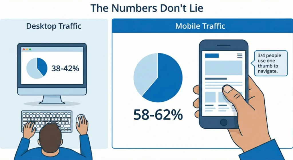
Your customers are already mobile-first. Your website needs to catch up.
This shift isn’t just about screen size—it directly impacts your rankings, conversions, and long-term growth. Businesses investing in mobile-first website development consistently see stronger engagement metrics because their sites are built around how people actually browse today.
And if your marketing strategy doesn’t account for how users behave on mobile, you’re not just losing traffic—you’re losing qualified buyers. That’s why mobile-first design is increasingly tied to broader digital marketing strategy in Manchester, NH and beyond.
When most of your audience interacts with you through a 6-inch screen, that screen becomes your primary storefront—not an afterthought.
Designing for Thumb Reach: Where Mobile Navigation Should Actually Live?
Hold your phone right now. Where does your thumb naturally rest?
Probably somewhere around the bottom third of the screen. The top corners? Nearly impossible to reach without shifting your grip or using your other hand.
Yet most websites still put their main navigation at the top. Every time someone wants to navigate, they’re stretching, repositioning, or risking dropping their phone.
Apps like Instagram and Spotify put their main navigation at the bottom. That’s not a trend—it’s ergonomics. Your most important actions should live where thumbs naturally reach. This isn’t just convenient. It’s the difference between someone exploring your site or leaving because it feels awkward.
From a strategic standpoint, this directly impacts engagement metrics that influence search engine marketing performance. If users struggle to navigate, bounce rates rise—and that weakens both paid and organic performance.
It also affects how clearly your calls to action are positioned. A well-placed bottom navigation paired with strong mobile CTAs can dramatically improve lead flow, especially when integrated into a broader conversion-focused web strategy.
When navigation works with natural thumb movement instead of against it, friction disappears—and friction is what costs you customers.
Why Mobile-First Design Forces Simpler, Higher-Converting Experiences?
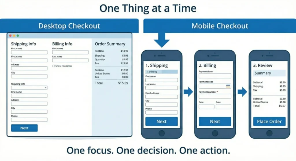
Desktop sites show you everything at once. Product details, reviews, related items, shipping information, trust badges—all visible in one glance.
Mobile can’t do that. More importantly, it shouldn’t.
When someone’s walking and checking their phone, they don’t have the mental bandwidth to process seven things simultaneously. Mobile-first design breaks complex tasks into clear, sequential steps.
Your checkout process on desktop might show shipping, billing, and order summary in three columns. On mobile, that becomes three screens. Shipping. Then billing. Then review. One focus. One decision. One action.
This simplification for mobile actually makes the experience better on desktop too. People prefer clarity over option overload regardless of screen size.
This same principle applies to lead generation forms, quote requests, and appointment bookings. If your site supports B2B vs B2C marketing strategies, the way you simplify the funnel will look different—but the psychology is the same. Reduce cognitive overload. Increase completion rates.
Sequential design also supports stronger performance across digital marketing campaigns because clearer funnels produce better conversion data, better retargeting signals, and stronger ROI.
This simplification for mobile actually improves the desktop experience too. When you design for clarity first, you remove unnecessary clutter everywhere.
Mobile Typography & Readability: Designing for Real-World Viewing Conditions
That perfectly sized paragraph on desktop becomes illegible on mobile—or worse, it’s readable but overwhelming. When someone’s trying to read in bright sunlight or a dim bedroom, contrast and size matter.
Lines need to be short enough to scan without losing your place. Headers need to grab attention without dominating the screen. And every link needs to be large enough to tap accurately. Nothing kills momentum like accidentally tapping the wrong link three times in a row.
This isn’t just design preference—it directly affects engagement signals that influence SEO performance in Manchester, NH and beyond. If users struggle to read your content, dwell time drops and bounce rates climb.
Mobile readability also impacts how your content performs within broader content marketing strategies
. Strong messaging means nothing if it’s physically difficult to consume.
Readable mobile typography typically includes:
- Larger base font sizes than desktop
- Strong contrast between text and background
- Generous line spacing
- Clear visual hierarchy
- Tap-friendly inline links
When someone can scan, understand, and act without friction, your site feels trustworthy. When they have to zoom, squint, or re-read sentences, trust erodes instantly.
Mobile Image Optimization: Speed, Cropping & Performance That Protect Rankings
Sending a massive desktop-sized image to a phone wastes your customer’s data, slows your load time, and tanks your search rankings.
Smart mobile-first sites serve different image sizes based on the device. A phone gets a smaller file. A tablet gets a medium version. A desktop gets the full resolution. Your customer gets a fast experience. Google rewards you with better visibility—especially in competitive local SEO results where speed can determine who appears first.
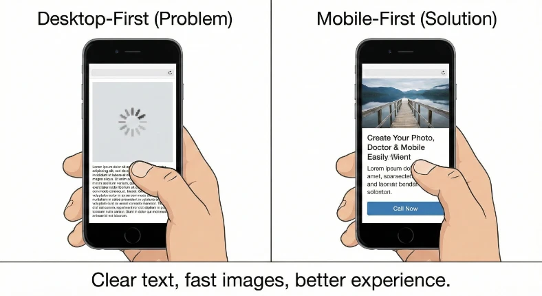
Better yet, serve completely different crops. That wide landscape shot of your team looks great on a 27-inch monitor. On a phone, everyone’s faces are too small to see. Serve a tighter crop that shows faces clearly on phones, and save the wide shot for desktops.
Modern image formats can be 50% smaller with no quality loss. Load the most important images first. Wait to load images below the fold until someone scrolls near them. These techniques add up to seconds shaved off your load time—and seconds directly influence performance in search engine optimization strategy.
If your mobile site feels slow, your customers won’t wait—and neither will Google.
What Google Actually Measures on Your Mobile Site (And Why It Affects Rankings)
Google tracks three specific things about your mobile experience, and they directly impact your search rankings:
- First, how fast your site responds when someone taps something. Under 200 milliseconds feels instant. Over 500 milliseconds feels broken. If someone taps your “Call Now” button and nothing happens for a full second, they assume it’s broken and leave. That hesitation weakens both user trust and your search engine marketing performance.
- Second, how fast your main content appears. Under 2.5 seconds keeps people engaged. Over 4 seconds loses them. This is especially critical for mobile users on cellular connections. Improving this metric is foundational to strong SEO services in Manchester, NH because Google prioritizes sites that deliver content quickly.
- Third, Whether your content jumps around while loading. On a phone, when a button shifts 50 pixels while someone’s tapping it, they accidentally tap the wrong thing. Ads loading late and pushing text down frustrate users and hurt your score.
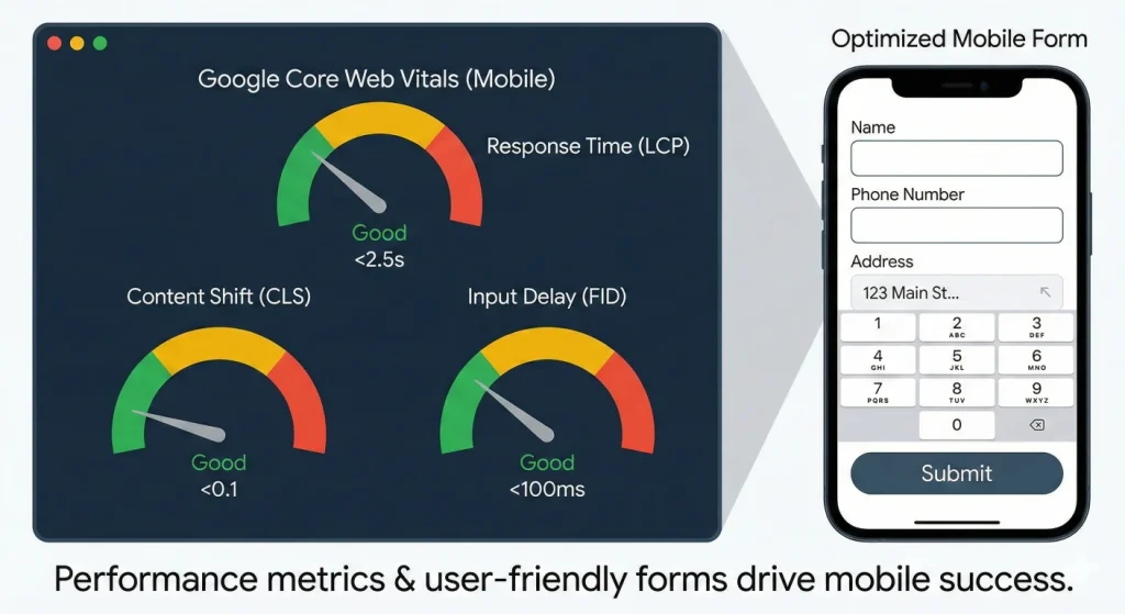
Google also measures Interaction to Next Paint (INP), which evaluates how responsive your site feels after interaction. If menus lag or forms hesitate, your score drops.
These aren’t abstract performance metrics. They’re measurements of real user frustration—and Google uses them to determine whether people are getting good experiences on your site.
Mobile Forms That Increase Conversions Instead of Killing Them
Typing on glass is miserable. Every character someone has to type on a phone increases the chance they’ll abandon your form.
Mobile-first forms minimize typing. Use the correct input types so the right keyboard appears automatically—typing a phone number should bring up a number pad, not a full keyboard. Format inputs automatically as someone types. Replace text fields with simple plus and minus buttons for quantities.
If someone has to type their address, offer autocomplete or integrate with a service that fills it in based on zip code. Every eliminated keystroke is a step closer to conversion.
Large, obvious buttons work better than small checkboxes. Clear labels eliminate guesswork. Error messages should appear immediately—not after someone tries to submit. When friction builds silently, abandonment follows.
These aren’t nice-to-haves. They’re the difference between someone completing your form or abandoning it halfway through. This is particularly important for lead generation campaigns tied to email marketing strategy or appointment scheduling funnels. If your form experience is clunky, you’re not just losing a lead—you’re wasting the traffic you paid for.
Mobile-first forms respect the reality that typing on a phone is work. The less work required, the more conversions you capture.
Why Mobile-First Design Gives Local Businesses a Competitive Edge?
Local businesses benefit more from mobile-first design than almost anyone else. Someone searching “plumber near me” is probably standing in water right now. They’re not researching. They’re ready to call.
Your mobile site must support that urgency.
Your mobile site needs phone numbers they can tap to call immediately—not numbers trapped in images. Directions should open instantly in maps. Hours visible without scrolling. Fast load times even on slower cellular connections. Your location should be easy to find. These details directly influence your visibility in Google Business Profile optimization and map pack results.
Google knows these searches are urgent. Sites that load fast and put action first get prioritized in local results, where proximity, relevance, and engagement signals determine who earns top placement.. Your mobile experience directly impacts whether you show up when someone needs you.
If your site forces people to pinch, zoom, or hunt for your phone number, they won’t complain. They’ll tap your competitor instead.
What Mobile-First Design Actually Means for Your Business Growth?
Mobile-first design isn’t a technical preference. It’s recognizing where your customers actually are—and how they make decisions.
If your site was built desktop-first, it might technically “work” on phones. But it was probably optimized for keyboards and mice, then squeezed to fit touchscreens. That shows. Your bounce rates on mobile traffic probably confirm it.
Starting mobile-first means your most important content and actions come first. Your site loads fast on real-world cellular connections. Navigation happens where thumbs naturally reach. Forms feel designed for touch, not retrofitted for it.
The discipline of designing for a small screen makes every element justify its existence. When you expand to desktop, you add features and polish. You don’t subtract chaos.
Time to Check Your Mobile Foundation
Pull out your phone. Visit your website. Be honest:
- Is your navigation easy to reach with one thumb?
- Can you read the text comfortably without zooming?
- Do buttons feel built for touch—or too small to tap confidently?
- Does your site load quickly on cellular data, not just Wi-Fi?
- Can you find what you need and take action without friction?
If you’re squinting, pinching to zoom, or waiting for things to load, your customers are experiencing the same friction. They’re just not telling you about it. They’re leaving.
Mobile-first design is not a cosmetic upgrade. It’s a performance upgrade. It affects visibility, engagement, conversions, and how professional your brand feels in seconds.
Want to see how your site performs on mobile? Our team runs free mobile performance assessments for New Hampshire businesses. No pitch—just data showing where your mobile experience stands and what’s actually costing you customers. Reach out if you want the truth about your mobile presence.
👉 Request your free mobile performance assessment and see what your customers are actually experiencing on their phones.
Ready to Take Your Brand Beyond Ordinary?
Your marketing shouldn’t just exist. It should perform. If you’re done settling for “good enough,” let’s build something impossible to ignore. Brandit helps you connect every digital, physical, and promotional touchpoint into one unstoppable brand experience.
Real Results,
Real Reactions
What Our Clients Say
"I sent out three bids for my marketing needs for this year and Brandit was the most responsive and provided great ideas. One company I reached out hadn't even gotten back to me while the other wasn't even close to being comparable to Brandit's creativity, pricing and service."
"I have used Brandit for several projects and they always come through with fantastic pricing and customer service. I highly recommend them."
Southern New Hampshire University

"Thanks to Brandit's generous contribution to the Big Ideas for Building Independence Capital Campaign, Easterseals NH is now better able to serve people with disabilities or special needs. With your support, we raised nearly $2.6 million for renovations to our headquarters."
"It has been an incredible journey! We couldn't have done it without you, and wish to take this opportunity to thank you and your team at Brandit Marketing Solutions for all that you have done and your generous donation."
Easterseals, NH
"Bringing Brandit Marketing Solutions into the CMC-fold is the best thing and most appreciative thing I've done since being at the Hospital."
Catholic Medical Center
"Exceptional does not even begin to cover the work that these people do. I have worked closely with other marketing firms and Brandit tops them every time. From innovative ideas to customer service that rivals the best of the best. I just couldn't speak more highly of them."
Southern New Hampshire University
"The Granite Group, headquartered in Concord, NH, distributes plumbing, heating, cooling, water and propane supplies to contractors and fuel dealers across New England through over 45 wholesale branches and their Online Store. The company also operates 15 retail showrooms under The Ultimate Bath Store name.
Brandit is pleased to say that we have been working with the Granite Group for over ten years which happens to be almost as long as this company has been in existence. In 2020, TGG was named one of New Hampshire's best places to work."
The Granite Group
10+ Year Partnership

"Over my long career, I have been in a position where I have worked closely with numerous vendors/suppliers. I can honestly say that I have never engaged with a company that is as amazing and responsive as Brandit."
"A sincere thanks to the team for the hustle on getting our shirts and tradeshow materials done for our group! You really relieved our pressure and I know it wasn't an easy task. Your effort and turnaround time was and is appreciated. Believe me when I say that I do not take for granted the relationship we have built over the years. Your service is top notch."
C&S Wholesale Grocers

"For almost a decade, the team at Brandit delivered successful and effective marketing solutions, spearheaded the merchandising of the FIRST brand by creating one-of-a-kind products, built, hosted, and managed their very first ecommerce store supporting all programs, staff, partners, sponsors, teams, and customers globally.
In addition, Brandit set up and managed multiple on-site retail stores at their premier Championship events where we serviced over 65,000 attendees. Today we provide web services as well as branded merchandise for regional partners".
FIRST Robotics

"The Brandit Marketing Solutions Ltd Team is wonderful to work with and we appreciate what they do to make us look good! They have expanded their services in recent years to meet whatever marketing needs you may have…from apparel and giveaway items to video and web services to graphic design and printing services, even graphic enhancements for your interior/exterior office space."
"I have worked with this team since the founding of their company and look forward to many more years of working together!"
Boys & Girls Club of Manchester

"The Brandit team is a talented group of creative professionals that I've worked with for years. Top notch!"
Art Murphy
Our Insights
.

B2B vs B2C Marketing: What Local Brands Should Know in 2026
Two businesses. Same city. Same ad budget. Completely different results. A local restaurant owner runs Facebook ads featuring gorgeous food photography. Bookings spike within the week. Meanwhile, a commercial cleaning company runs nearly identical ads — same platform, same spend — and hears nothing. Not a single inquiry. Same tool. Same effort. Completely different outcome.…

WordPress vs Custom Development: Which Is Right for Your Business in 2026?
Which Platform Powers Your Business Goals in 2026? Your website is the foundation of your digital presence. It’s where customers find you, learn about your services, and decide whether to do business with you. So when it’s time to build or rebuild that foundation, one question keeps coming up: Should you use WordPress, or invest…

Website Accessibility Compliance: Legal Requirements and Best Practices for 2026
If your business has a website, 2026 brings a new reality you need to understand. The rules around website accessibility have shifted from “nice to have” to “legally required” for many organizations. What was once voluntary guidance has become a compliance mandate with real deadlines, real enforcement, and real consequences for businesses that fall behind.…

Short-Form Video Content That Converts Local Customers
Your competitors are showing up in “Nearby” feeds on TikTok. They’re appearing in Instagram map searches. Their YouTube Shorts are ranking on Google when customers search for services in your area. You’re not. This isn’t about going viral. It’s about being found by the customer driving past your location right now, phone in hand, searching…

AI and SEO: How Machine Learning is Changing Search Rankings
The rules of search just changed. Here’s what your business needs to know. If your website traffic has felt unpredictable lately, you’re not imagining things. Between 2024 and 2025, Google fundamentally rewired how search works. The old playbook—keywords, backlinks, and page rankings—isn’t broken. It’s just incomplete. Search engines aren’t librarians anymore, pointing you to the…
")
What Are the Best Local SEO Tools for 2026? | Brandit
Did you know that 46% of all Google searches have local intent? And according to recent data, 80% of U.S. consumers search for local businesses at least weekly, while 32% do so daily. (Source). Those numbers prove one thing: Local SEO is no longer optional. It’s essential for any business that relies on nearby customers.…

Local vs Traditional SEO: Which One Does Your Business Need?
Ever searched “coffee near me” or “roofing contractor in Manchester, NH” and instantly saw Google Maps listings, business reviews, and contact info at the top? Now compare that to searching “best home decor ideas” where blog articles, Pinterest boards, and ecommerce sites dominate. This isn’t a coincidence. It’s Google interpreting your search intent and deciding…

Google Business Profile Optimization: Visuals, Posts & Products That Drive Local SEO
Once your Google Business Profile (GBP) is verified and fully filled out, the next step is engagement and heading into 2026, that’s not optional. Google’s local algorithm now tracks not just what’s on your profile, but how often it’s updated, how visually compelling it is, and how well it answers a searcher’s intent. The businesses…

Bots, Spam, and the Fight for Authenticity: How to Spot & Stop Imposters Online
If your inbox, contact form, or social media comments have been flooded lately with strange messages or suspicious “requests,” you’re not imagining it. AI-driven bots have gone mainstream, and they’re getting disturbingly good at pretending to be real people. Generative AI tools have made it easy for anyone to create automated programs that talk, type,…
")
Geofencing & How It Attracts Local Customers in Manchester, NH
Are you missing out on customers who pass by your storefront without ever stepping inside? If the answer is yes, there’s a smart solution. It’s called geofencing marketing, and it’s helping businesses in Manchester, NH connect with people right when they’re nearby your store, shop, or outlet. What is Geofencing & How Does It Work?…
Omnichannel Marketing Solutions
Merging creativity and technology for comprehensive brand experiences.

PIXELS
Harnessing digital platforms for impactful brand promotion and audience engagement through strategic touchpoints.

PROMOS
Making the intangible tangible through high-quality promotional items that echo your brand's voice and values.

PLACES
Transforming physical environments into powerful brand narratives that forge connections with everyone who enters your space.