Mobile-First Design: Why “Mobile-Friendly” Isn’t Enough in 2026
Your website loads on phones. But was it actually built for them?
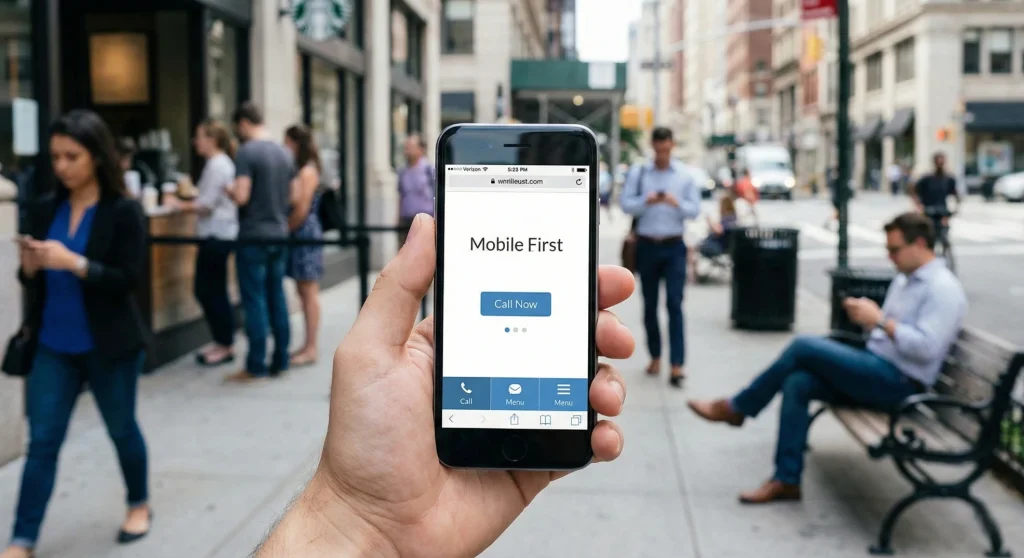
Most businesses still design for desktops first, then try to squeeze everything onto smaller screens. That approach is backward. Your customers aren’t browsing during lunch breaks at their desk anymore. They’re checking you out while standing in line, walking between meetings, or sitting in their car before they decide whether to walk into your store or your competitor’s.
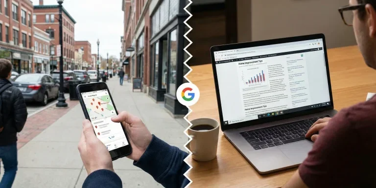
Google knows this. That’s why they rank your mobile site first now—even for people searching on desktops. If your mobile experience is weak, your search rankings suffer across the board.
Mobile-first design isn’t about making your site work on phones. It’s about building for phones first, then expanding for larger screens. This shift forces you to focus on what actually matters to your customers.
The Numbers Don’t Lie
Mobile devices generate 58-62% of all web traffic. Three-quarters of people use just one thumb to navigate on their phone. More than half of mobile visitors leave if a page takes longer than three seconds to load.

Your customers are already mobile-first. Your website needs to catch up.
Where Thumbs Actually Reach
Hold your phone right now. Where does your thumb naturally rest?
Probably somewhere around the bottom third of the screen. The top corners? Nearly impossible to reach without shifting your grip or using your other hand.
Yet most websites still put their main navigation at the top. Every time someone wants to navigate, they’re stretching, repositioning, or risking dropping their phone.
Apps like Instagram and Spotify put their main navigation at the bottom. That’s not a trend—it’s ergonomics. Your most important actions should live where thumbs naturally reach. This isn’t just convenient. It’s the difference between someone exploring your site or leaving because it feels awkward.
One Thing at a Time
Desktop sites show you everything at once. Product details, reviews, related items, shipping information, trust badges—all visible in one glance.
Mobile can’t do that. More importantly, it shouldn’t.
When someone’s walking and checking their phone, they don’t have the mental bandwidth to process seven things simultaneously. Mobile-first design breaks complex tasks into clear, sequential steps.
Your checkout process on desktop might show shipping, billing, and order summary in three columns. On mobile, that becomes three screens. Shipping. Then billing. Then review. One focus. One decision. One action.

This simplification for mobile actually makes the experience better on desktop too. People prefer clarity over option overload regardless of screen size.
Text You Can Actually Read
That perfectly sized paragraph on desktop becomes illegible on mobile—or worse, it’s readable but overwhelming. When someone’s trying to read in bright sunlight or a dim bedroom, contrast and size matter.
Lines need to be short enough to scan without losing your place. Headers need to grab attention without dominating the screen. And every link needs to be large enough to tap accurately. Nothing kills momentum like accidentally tapping the wrong link three times in a row.
Images That Load Fast
Sending a massive desktop-sized image to a phone wastes your customer’s data, slows your load time, and tanks your search rankings.
Smart mobile-first sites serve different image sizes based on the device. A phone gets a smaller file. A tablet gets a medium version. A desktop gets the full resolution. Your customer gets a fast experience. Google rewards you with better rankings.

Better yet, serve completely different crops. That wide landscape shot of your team looks great on a 27-inch monitor. On a phone, everyone’s faces are too small to see. Serve a tighter crop that shows faces clearly on phones, and save the wide shot for desktops.
Modern image formats can be 50% smaller with no quality loss. Load the most important images first. Wait to load images below the fold until someone scrolls near them. These techniques add up to seconds shaved off your load time—and seconds determine whether someone stays or leaves.
What Google Actually Measures
Google tracks three specific things about your mobile experience, and they directly impact your search rankings:
How fast your site responds when someone taps something. Under 200 milliseconds feels instant. Over 500 milliseconds feels broken. If someone taps your “Call Now” button and nothing happens for a full second, they assume it’s broken and leave.
How fast your main content appears. Under 2.5 seconds keeps people engaged. Over 4 seconds loses them. This is especially critical for mobile users on cellular connections.
Whether your content jumps around while loading. On a phone, when a button shifts 50 pixels while someone’s tapping it, they accidentally tap the wrong thing. Ads loading late and pushing text down frustrate users and hurt your score.

These aren’t abstract performance metrics. They’re measurements of real user frustration—and Google uses them to determine whether people are getting good experiences on your site.
Forms That Don’t Make People Give Up
Typing on glass is miserable. Every character someone has to type on a phone increases the chance they’ll abandon your form.
Mobile-first forms minimize typing. Use the correct input types so the right keyboard appears automatically—typing a phone number should bring up a number pad, not a full keyboard. Format inputs automatically as someone types. Replace text fields with simple plus and minus buttons for quantities.
If someone has to type their address, offer autocomplete or integrate with a service that fills it in based on zip code. Every eliminated keystroke is a step closer to conversion.
Large, obvious buttons work better than small checkboxes. Clear labels eliminate guesswork. Error messages should appear immediately—not after someone tries to submit.
These aren’t nice-to-haves. They’re the difference between someone completing your form or abandoning it halfway through.
The Local Business Advantage
Local businesses benefit most from mobile-first design. Someone searching “plumber near me” is probably standing in water right now. They’re not researching. They’re ready to call.
Your mobile site needs phone numbers they can tap to call immediately—not numbers trapped in images. One-tap directions to your location. Hours visible without scrolling. Fast load times even on slower cellular connections.
Google knows these searches are urgent. Sites that load fast and put action first get prioritized in local results. Your mobile experience directly impacts whether you show up when someone needs you.
What This Actually Means for Your Business
Mobile-first design isn’t a technical preference. It’s recognizing where your customers actually are.
If your site was built desktop-first, it might technically “work” on phones. But it was probably optimized for keyboards and mice, then squeezed to fit touchscreens. That shows. Your bounce rates on mobile traffic probably confirm it.
Starting mobile-first means your most important content and actions come first. Your site loads fast on real-world cellular connections. Navigation happens where thumbs naturally reach. Forms feel designed for touch, not retrofitted for it.
The discipline of designing for a small screen makes every element justify its existence. When you expand to desktop, you add features and polish. You don’t subtract chaos.
Time to Check Your Foundation
Pull out your phone. Visit your website. Be honest:
Is your navigation easy to reach? Can you actually read the text without zooming? Do buttons feel like they were built for touch? Does the site load fast on cellular? Can you find what you need and take action without frustration?
If you’re squinting, pinching to zoom, or waiting for things to load, your customers are experiencing the same friction. They’re just not telling you about it. They’re leaving.
Want to see how your site performs on mobile? Our team runs free mobile performance assessments for New Hampshire businesses. No pitch—just data showing where your mobile experience stands and what’s actually costing you customers. Reach out if you want the truth about your mobile presence.
Ready to Take Your Brand Beyond Ordinary?
Your marketing shouldn’t just exist. It should perform. If you’re done settling for “good enough,” let’s build something impossible to ignore. Brandit helps you connect every digital, physical, and promotional touchpoint into one unstoppable brand experience.
Real Results,
Real Reactions
What Our Clients Say
Our Insights
.

WordPress vs Custom Development: Which Is Right for Your Business in 2026?
Which Platform Powers Your Business Goals in 2026? Your website is the foundation of your digital presence. It’s where customers find you, learn about your services, and decide whether to do business with you. So when it’s time to build or rebuild that foundation, one question keeps coming up: Should you use WordPress, or invest…

Website Accessibility Compliance: Legal Requirements and Best Practices for 2026
If your business has a website, 2026 brings a new reality you need to understand. The rules around website accessibility have shifted from “nice to have” to “legally required” for many organizations. What was once voluntary guidance has become a compliance mandate with real deadlines, real enforcement, and real consequences for businesses that fall behind.…

Short-Form Video Content That Converts Local Customers
Your competitors are showing up in “Nearby” feeds on TikTok. They’re appearing in Instagram map searches. Their YouTube Shorts are ranking on Google when customers search for services in your area. You’re not. This isn’t about going viral. It’s about being found by the customer driving past your location right now, phone in hand, searching…

AI and SEO: How Machine Learning is Changing Search Rankings
The rules of search just changed. Here’s what your business needs to know. If your website traffic has felt unpredictable lately, you’re not imagining things. Between 2024 and 2025, Google fundamentally rewired how search works. The old playbook—keywords, backlinks, and page rankings—isn’t broken. It’s just incomplete. Search engines aren’t librarians anymore, pointing you to the…

What Are the Best Local SEO Tools for 2026? | Brandit
Did you know that 46% of all Google searches have local intent? And according to recent data, 80% of U.S. consumers search for local businesses at least weekly, while 32% do so daily. (Source). Those numbers prove one thing: Local SEO is no longer optional. It’s essential for any business that relies on nearby customers.…

Local vs Traditional SEO: Which One Does Your Business Need?
Ever searched “coffee near me” or “roofing contractor in Manchester, NH” and instantly saw Google Maps listings, business reviews, and contact info at the top? Now compare that to searching “best home decor ideas” where blog articles, Pinterest boards, and ecommerce sites dominate. This isn’t a coincidence. It’s Google interpreting your search intent and deciding…

Google Business Profile Optimization: Visuals, Posts & Products That Drive Local SEO
Once your Google Business Profile (GBP) is verified and fully filled out, the next step is engagement and heading into 2026, that’s not optional. Google’s local algorithm now tracks not just what’s on your profile, but how often it’s updated, how visually compelling it is, and how well it answers a searcher’s intent. The businesses…

Bots, Spam, and the Fight for Authenticity: How to Spot & Stop Imposters Online
If your inbox, contact form, or social media comments have been flooded lately with strange messages or suspicious “requests,” you’re not imagining it. AI-driven bots have gone mainstream, and they’re getting disturbingly good at pretending to be real people. Generative AI tools have made it easy for anyone to create automated programs that talk, type,…

Geofencing & How It Attracts Local Customers in Manchester, NH
Are you missing out on customers who pass by your storefront without ever stepping inside? If the answer is yes, there’s a smart solution. It’s called geofencing marketing, and it’s helping businesses in Manchester, NH connect with people right when they’re nearby your store, shop, or outlet. What is Geofencing & How Does It Work?…

Q3 Tariff Update: The Price Increases & Marketing Strategies for 2026
The financial cascade is now complete: Product Categories: The New Winners and Losers Most Challenging Categories Metals & Drinkware: 25-50% tariffs on steel/aluminum continue to devastate traditional favorites Electronics: Consumer tech faces 10-25% increases, though selective exemptions create opportunities Jewelry: The “triple-whammy” of high tariffs, record precious metal prices, and 50% copper tariffs makes this…


